
 Apparently, you can. Who knew?
 We LOVED this challenge (design a book cover, for those of you who haven't seen the show). We're always amazed when a show like this manages to come up with challenges that are entertaining, easy to grasp by the viewers and still well within the milieu of the contestants.
 In addition, we just loved the staging of the challenge. A reality competition has to have a series of factors in place in order to be successful (charismatic judges, entertaining contestants, imaginative challenges) and one that often gets overlooked is staging. Think of it. They could have taken the contestants to a book store or even just a room with some books in it. Staging it this way was fun and visually interesting.
Alright, let's look at the best and worst:
John (Winner):
 We just loved this. It was graphic and interesting and had a slightly retro '60s/'70s science fiction paperback feel to it. The ladder is what makes it.

 Our only real issue was the lettering, which looked a little too crude and naive for such a polished cover. In fact, we have to admit that we were a little surprised that all the artists included the title and author in their pieces. We're not exactly experts on book cover art but even in the examples they showed, the art was separate from the title and author in more than a few cases. Just scroll back up and look.
 Still, the final product looks great. Very eye-catching.
 So congrats to John! It has to be said: every time he appears onscreen T says to Lo, "I can't help it. He looks like a puppy, doesn't he?" Something about the big brown eyes and the little round nose. All he needs is a couple of floppy ears and a little black makeup for his nose and he's set to be Gay Puppy for Halloween.
Mark (runner up):
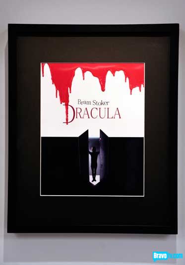 Another really strong entry. It was originally our pick for the winner but the judges said a couple things that changed our minds.
 Namely, that it looked more like a movie poster than a book cover. We wouldn't have thought of that, but they're right. It's perhaps a bit too literal. They seem to have been looking for something a little more vague and expressive.
 Also, Jerry was absolutely right when he pointed out that one drip of blood marking the D would have been more effective than the rain of blood he went with.
Peregrine (bottom 3):
 Do not get.
 It's ... interesting, that's for sure. We don't mind looking at it. But it doesn't work as a book cover generally or as a cover for The Time Machine specifically. It's just busy and confusing.
 She mentioned Victorian wallpaper as her inspiration. Well, okay. But a) What does that have to do with the book aside from the time period it's set in, and b) It doesn't really look like Victorian wallpaper.
 Also do not get.
 It's blandly pretty in a greeting card kind of way but it's not at all eye-catching.
 Not to mention it's completely off-tone for the book. This kind of naked sensuality really has nothing whatsoever to do with Pride and Prejudice and we're trying like hell to figure out what the fedora is there for. Is she about to do a Chicago-style Fosse number complete with jazz hands?
 And misspelling the author's name is simply unforgivable. Perhaps she should have spent less time taking yet another sexy picture of herself and more time researching the book. She's damn lucky there was one piece inarguably worse than hers.
Judith (eliminated):
 Said worse piece being this one.
 You know what really irritates us about this piece, aside from its aggressive ugliness, we mean? It's that she wrote the words backwards but she didn't write the letters backwards. We're not saying it would have been better or made more sense, but doing it mirror image style rather than just writing the words in reverse letter order would have at least been, we don't know... more consistent, we guess.
 To a casual browser, this will simply look like a non-English language book of some sort. The eye can perceive mirror images easier than it can words written in reverse letter order.
 Aside from that, it's just plain fucking ugly and smudged and sloppy-looking.
 We definitely think she's a talented artist and we were looking forward to her as the whacky annoying contestant, but frankly, that got old very quickly. Her attitude that she was above assigned art was snotty in the extreme, ahistorical (plenty of masterpieces in the history of art were commissioned and even in some cases commercially inspired), and totally fucking ridiculous for someone who AGREED TO COMPETE IN A REALITY TELEVISION SHOW.
It's a shame, because as the only artist in the group in her age bracket, she had an opportunity to really bring a different voice and point of view to the table. Had she focused on that instead of constantly putting down her competitors (although to be fair, we agreed with almost every smackdown) and complaining about how she was above things, she could have really made an impact.
[Photo Credit: BravoTV.com - Screencaps: projectrungay.blogspot.com]
Post a Comment
Labels: Work of Art, Work of Art Season 1, Work of Art Season 1 Episode 3


No comments:
Post a Comment